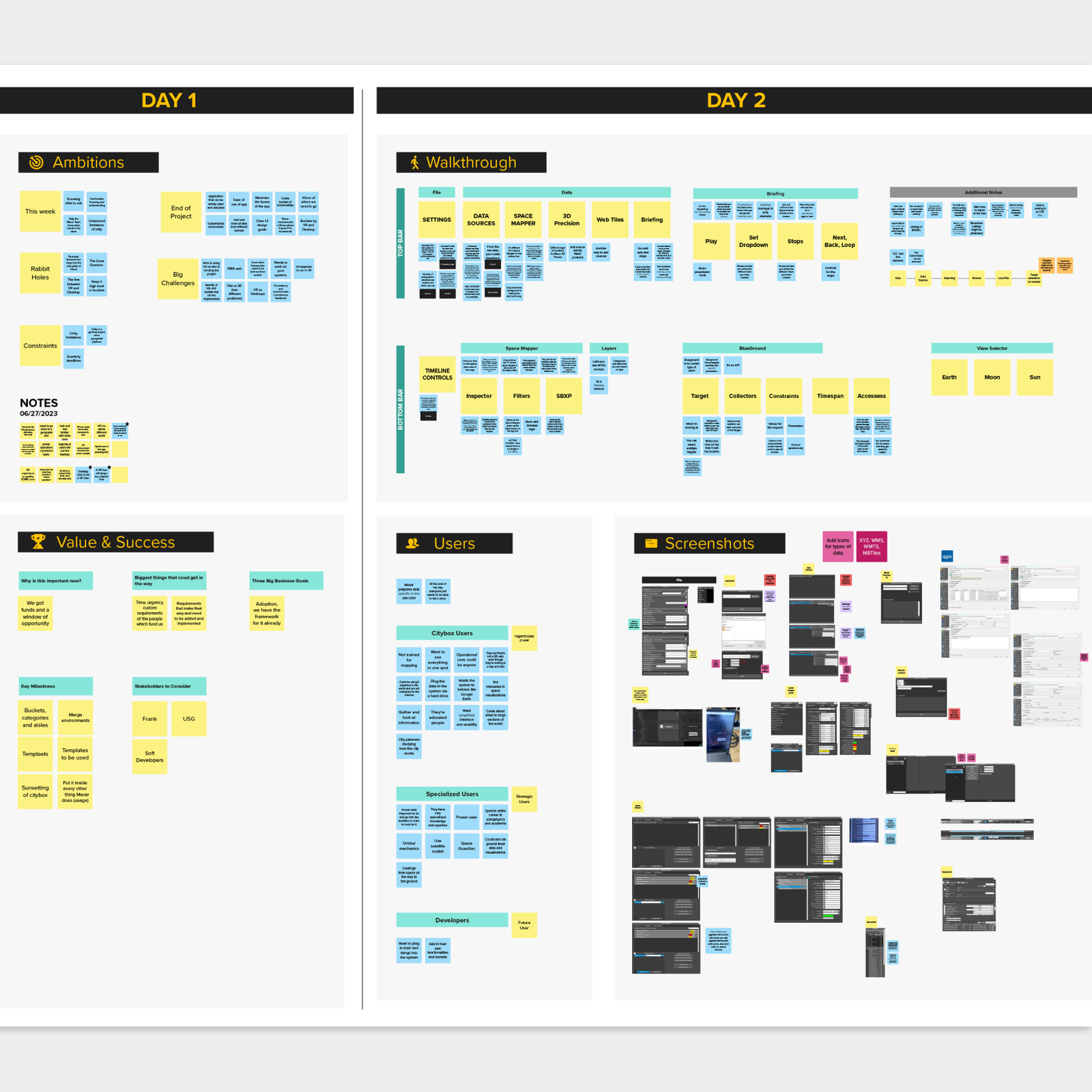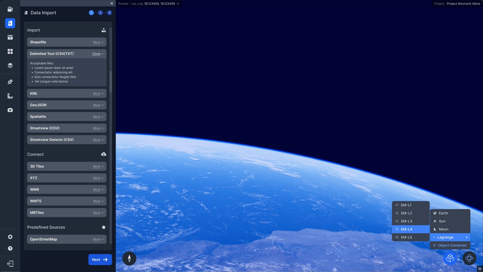
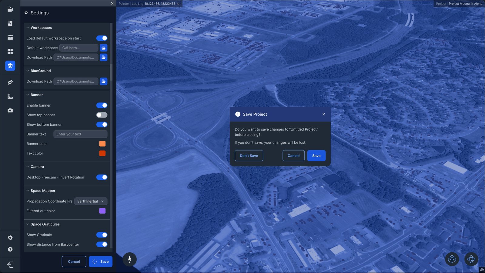
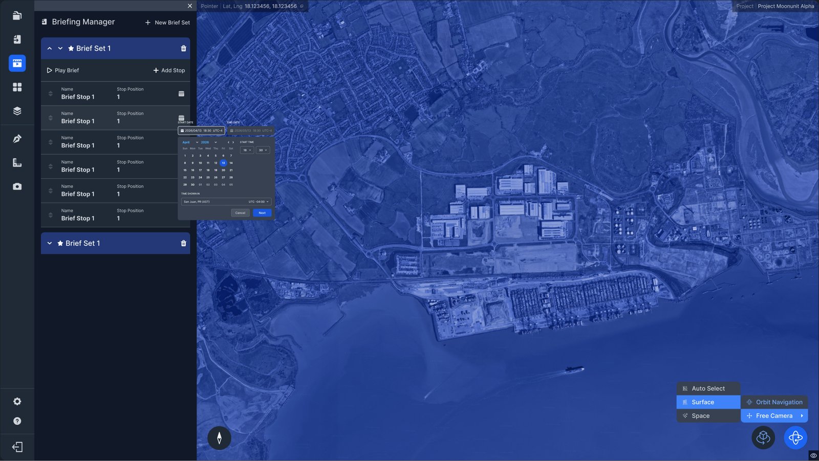
It is a powerful tool built by engineers for engineers… and it showed. The desktop application could visualize satellite imagery, track assets across the globe, and scrub through temporal data at cislunar scales, but its interface reflected none of that sophistication. Raw layer names substituted for navigation, UI elements and features that had been added throughout different release versions and without the cohesion that a unified design system affords, dialogs floated unanchored over the viewport, and a cluttered bottom toolbar tried to hold together playback controls, coordinates, and time scrubbing simultaneously. Users who weren't already deep experts in the system had little chance of finding their footing.
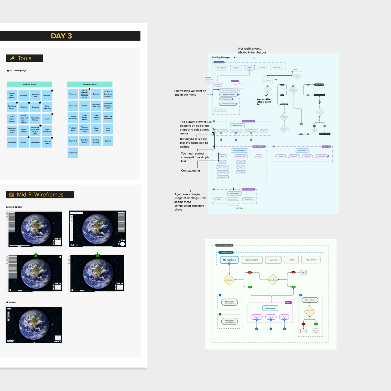
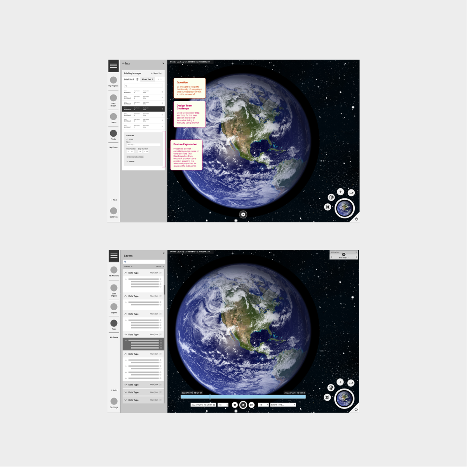
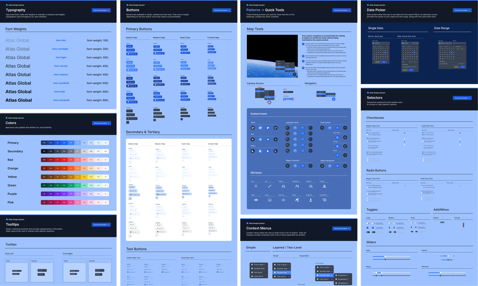
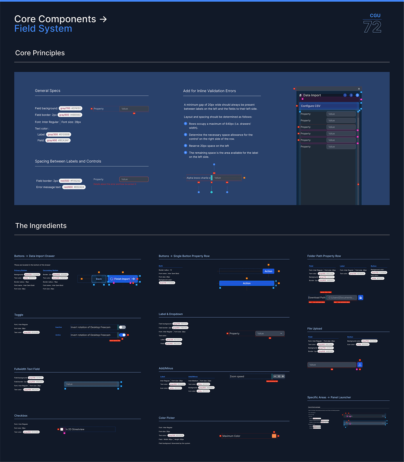
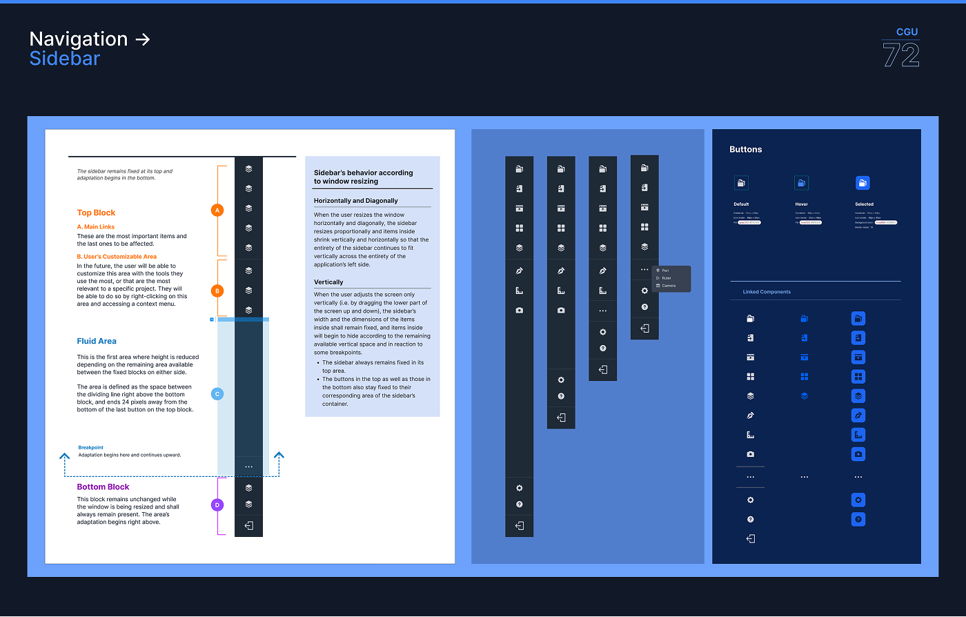
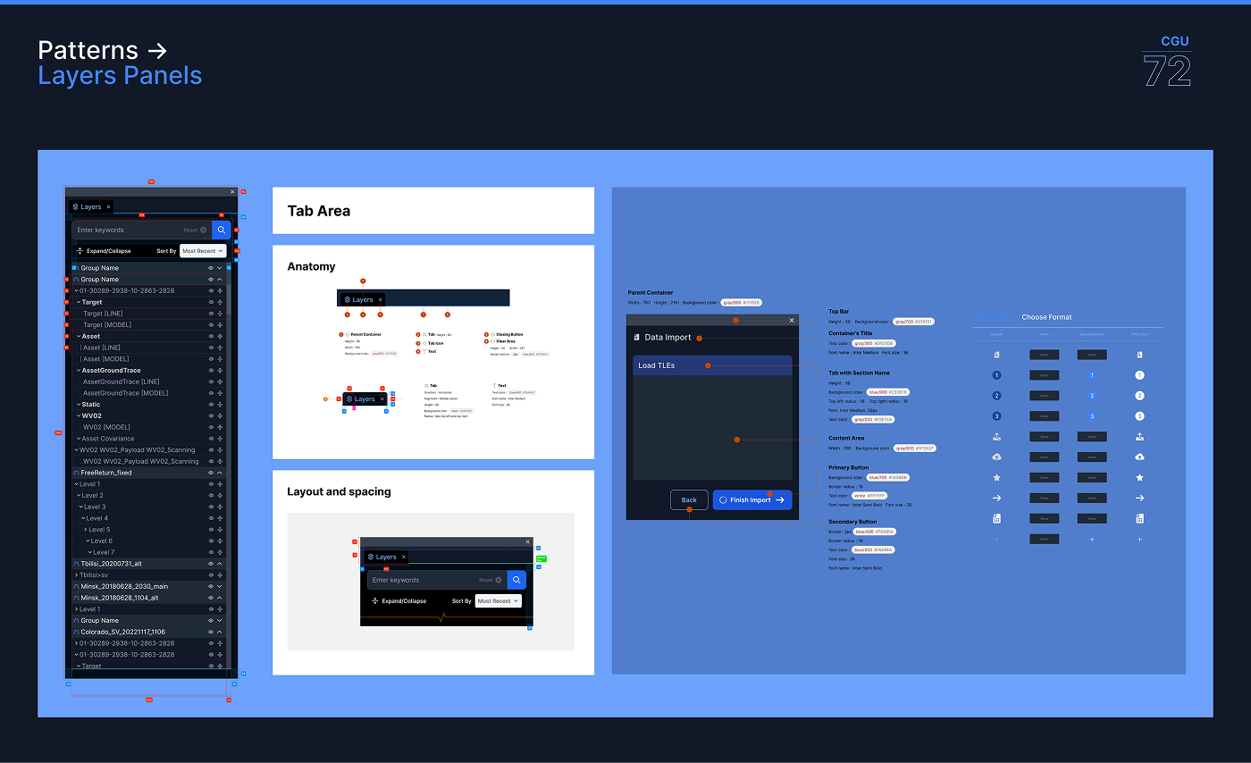
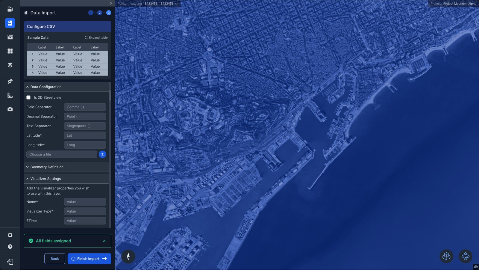
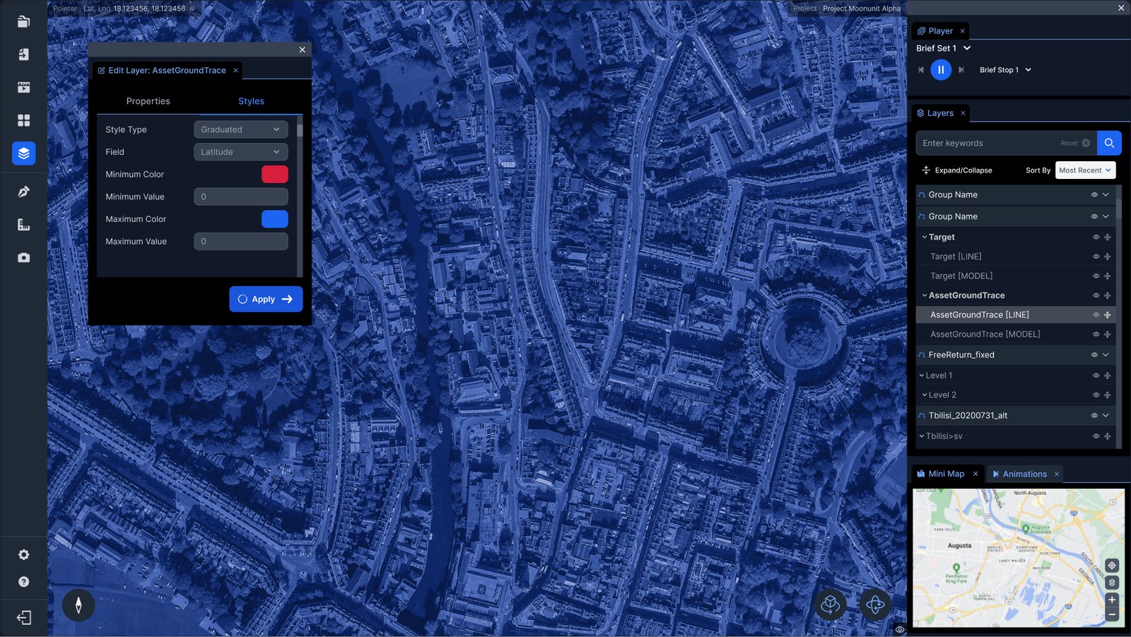
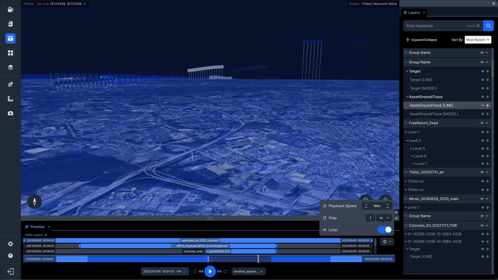
Atlas's redesign wasn't just a visual refresh; the product's scope had expanded significantly, from Earth-based geospatial analysis to full cislunar operations, introducing navigation concepts like Earth-Moon Lagrange points that had no precedent in any standard interface pattern. This is what made a purpose-built design system non-negotiable: the domain demanded components that simply didn't exist elsewhere. The result was a modern web application with a clean icon-based sidebar, a structured multi-step data import flow with sample data previews and inline validation, a searchable and sortable layers panel with meaningful hierarchy, and a timeline with proper playback controls, each solving a specific pain point that the original application had left unaddressed.
Some of the biggest challenges in designing views and interactions were based around various technological restrictions we needed to work with: a complex backend handling high quantities of processes at a time; an existing tech stack we were required to build over in order to maintain backward compatibility with legacy systems' intricacies; processing massive amounts of data in tandem with user-generated datasets (static and temporals), all the while maintaining healthy loading performance; hardware restrictions informed by strict security protocols. Equally important was giving users control over the customization of their workspace, by introducing panels that could be detached, moved around and docked anywhere, so that users could customize their views. In an application where the map is the work, screen real estate is precious. The design had to get out of the way as much as it had to be present, allowing analysts to maximize their view of the map and the temporal scenes, keeping within reach the tools they need, and hide everything else that they don't.